Wedding Guest Colours for Caramel Skin Tones (2026)
If dressing has always felt harder for you than it seems to be for everyone else, this page is going to be a relief. You were not imagining it.
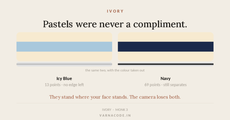
Five of Caramel’s eight colours sit too close to Caramel skin to be worn near the face. Only three clear the line. No other tone in the system comes close to that — most have none.
First — are you actually Caramel?
Caramel is Monk 6 — medium-deep with a warm, often olive-leaning undertone. Green or yellow-green veins, gold over silver, and skin that deepens in sun without burning.
Not certain? The skin tone chart puts all eight side by side with hex values, and the free quiz settles it in about a minute. No selfie, no sign-up.
Why Caramel behaves differently at a wedding
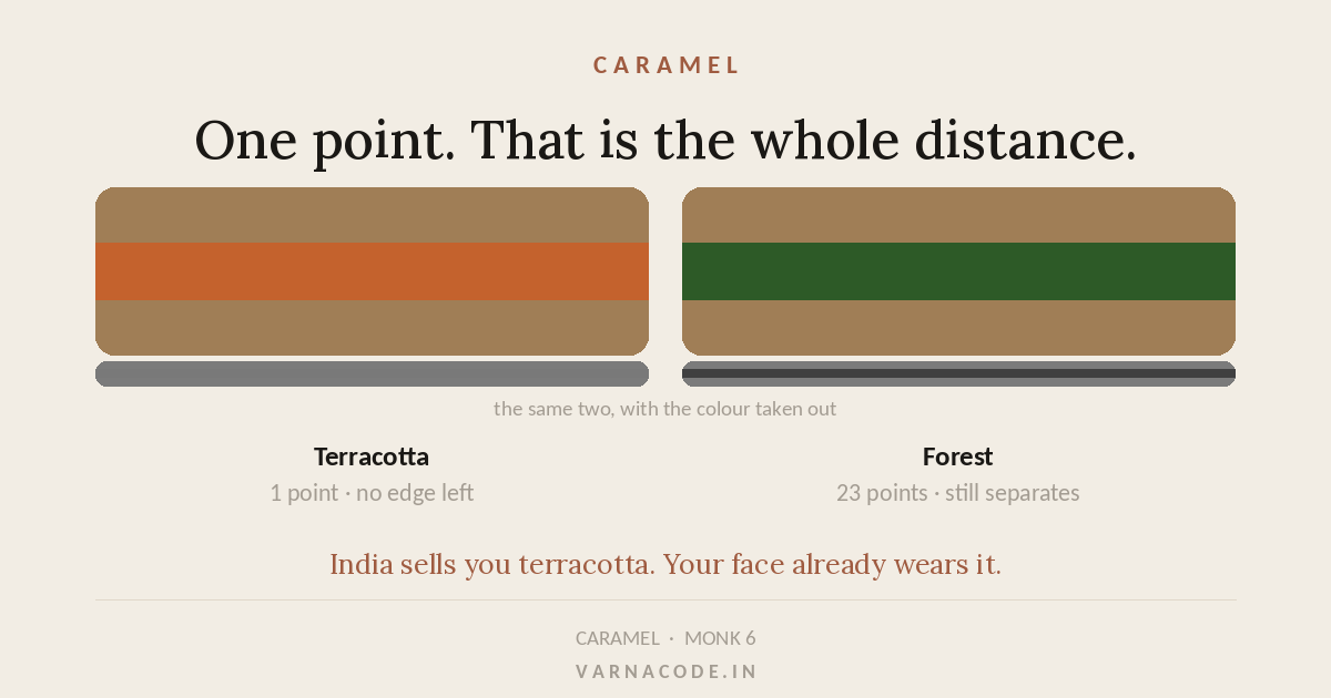
Caramel sits at a lightness of about 48, and its season is Deep Autumn — a palette built from terracotta, sienna, bronze and spice. Those are beautiful colours and they are almost exactly Caramel’s own depth. Terracotta is one point away. Spice Orange is one point away. Bronze is four.
Evening reception — your strongest colours
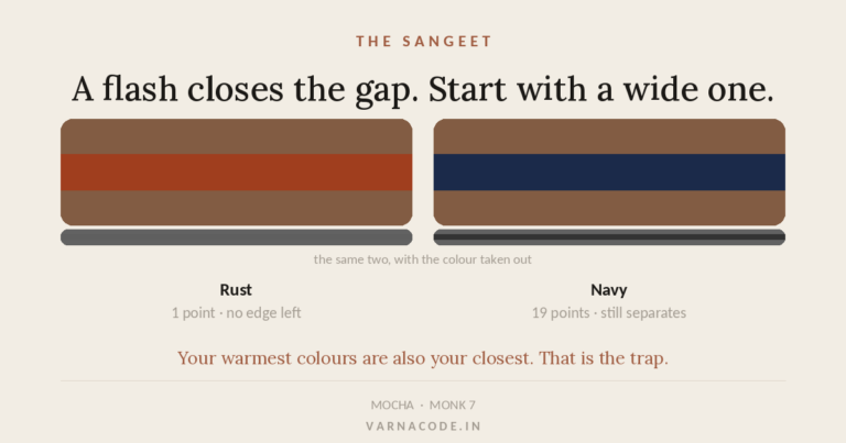
Dark room, warm uplighting, and a great many photographs taken with a flash. A flash lifts your face and closes the distance between your skin and whatever is next to it — so an evening function wants your deepest, strongest colours rather than your prettiest.
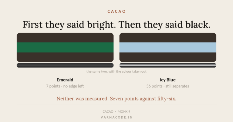
Three colours clear your face and all three are deep and cool-leaning. Aubergine at twenty-six is the strongest thing you own for an evening, and it is not what the shop will hand you.
Day functions — mehendi and haldi
Daylight is honest. No flash, no compression, and the quieter half of your palette finally works properly.
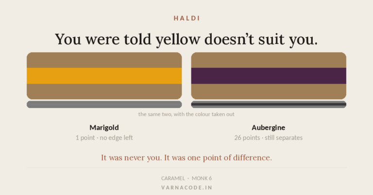
🔴 Haldi is the hardest function in the calendar for Caramel. Marigold sits one point from your skin, and neither of your own yellows clears the line either — Deep Mustard at ten, Bronze at four. You are the only tone of the eight with no safe yellow at all. The answer is placement, not avoidance.
⚠️ One thing specific to a mehendi. Henna dries a dark red-brown and sleeves get pushed to the elbow. Any rust, terracotta or sienna is henna-adjacent — lovely in the skirt, competing with the thing everyone is there to look at if it is at your cuff. More on that here.
Temple ceremonies and daytime rituals
Quieter, more covered, often photographed formally in daylight. This is where your neutrals do the work rather than your colours.
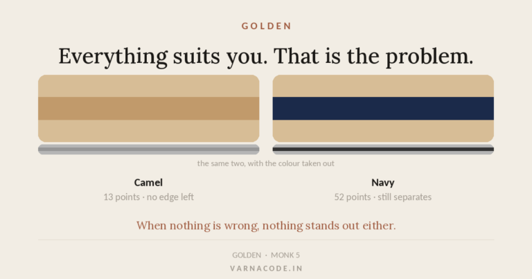
Neutrals for below the waist only: Camel at 5 points. Correct for your season, and they close up against your face.
The colours to be careful with
This is the longest care list of any tone, and none of it is your fault. Every one of these is a genuinely good colour on you — worn below the waist, in a skirt, in a print, anywhere but against your face.
In your own palette, too close to wear at the collar:
- Terracotta — 1 point from your skin
- Spice Orange — 1 point from your skin
- Bronze — 4 points from your skin
- Sienna — 8 points from your skin
- Deep Mustard — 10 points from your skin
🟢 Read that list as placement, not prohibition. A terracotta lehenga with an aubergine blouse is entirely correct. A terracotta blouse is not. The colour is right. The position is what changes.
If you only buy one thing
Caramel is the hardest tone to shop for in India, and nobody says so out loud. The entire wedding-wear market is built on rust, terracotta, copper and gold — and those are the exact colours sitting closest to your skin. Not wrong. Just quiet, right where you least want quiet. If you buy one thing, make it deep and cool: a forest, an aubergine, a deep olive. It will feel like a departure the first time. In photographs it will not look like a departure at all — it will look like the only person in the frame you can actually see.
The single most useful purchase for Caramel skin this season: Forest — 23 points clear of your skin, which is why it holds under a flash when softer colours collapse. It carries the sangeet and the reception on its own.
The second, if there is a second: Deep Olive at 18 points, for the daylight functions where the deep colour would read as too much before sundown.
Two pieces. Four functions. That is the entire wedding season solved, and it is roughly what the Wardrobe Audit works out for people — except it starts from what is already in your cupboard rather than from zero.
For men
The colours are identical. Skin does not have a gender and neither does the arithmetic. What changes is how much of it you wear.
Menswear puts colour in a smaller area, so the strongest colour usually belongs on the layer rather than the whole garment — a forest Nehru jacket over a plain kurta rather than a forest kurta. Same colour, same separation, less surface.
Full detail in the men’s ethnic wear guide, which covers all eight tones.
The honest summary
Caramel is the hardest tone in this system to dress, and that is a measurable statement rather than an opinion. Five of eight, one point, four points, eight points. If you have spent years quietly concluding that you are difficult, the arithmetic says otherwise — you were given a palette whose best colours happen to sit exactly where your face is.
And one thing worth saying plainly, because a colour chart cannot say it for you: none of this is a rule about what you are allowed to wear. It is a description of what happens to light between your face and your collar. If you love a colour that sits close to your skin, wear it — put it in the skirt, put it in the dupatta, put it anywhere but the six inches under your chin, and it will do everything you wanted it to do. The measurement is there to protect the thing you love, not to talk you out of it.
Four functions. One wardrobe. Six weeks.
Haldi wants your cheapest thing. The sangeet wants your boldest. Mehendi wants cool and deep. The reception wants quiet and far. Four different answers from one wardrobe — and the expensive mistake is solving each one by buying something new.
The Wardrobe Audit reads what you already own against your palette and returns a written plan: what works, what is quietly fighting your skin tone, and a buy list ordered so the first thing you buy unlocks the most outfits. Eleven questions. No photograph of you, ever.
Where to go from here
- Haldi colours — when the function’s own colour is not your colour
- Sangeet colours — why a flash changes the answer
- Mehendi colours — daylight, decor and the sleeve nobody plans for
- Reception colours — formal without defaulting to black
- Four functions, one wardrobe — which single piece unlocks the most
- The skin tone chart — if you are not certain Caramel is yours
Every colour value and every lightness gap on this page comes from an open dataset published under CC BY 4.0 — eight tones, twenty-four palettes, 192 colours, versioned so you can see what changed and when. If something here is wrong, you can check it yourself.
Launch price — first twenty
The Wardrobe Audit — ₹2,499
The quiz tells you your colours. This tells you what to do about them. You send photos of the clothes you actually wear — laid flat, in daylight, no people in the frame. I go through them against your palette and send back a written plan: what already works, what is quietly fighting your skin tone, what is missing, and a buy list ordered so the first thing you buy unlocks the most outfits.
Eight to twelve pages. Five working days. Your face is never involved — this site does not read people from photographs, and that does not change because you paid.
Opening to a small number of people first. Leave your email and I will write when a slot is free. No payment now, no obligation.
The quiz and your Wardrobe Plan stay free — always. This is the optional next step, not a paywall. Your email is only used to tell you when a slot opens.